Home Color Schemes: How to Choose Colours That Work (2026)
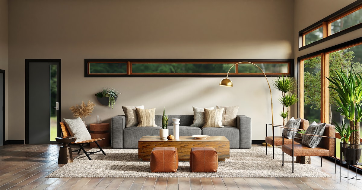
Quick answer: A home colour scheme works when it uses one palette throughout the house, with a 60-30-10 balance in each room: 60 percent dominant, 30 percent secondary, 10 percent accent. Choose colours with the same undertone, warm or cool, so rooms flow together.
At a glance
- A home colour scheme works when it uses one palette throughout the house, with a 60-30-10 balance in each room: 60 percent dominant, 30 percent secondary, 10 percent accent. Choose colours with the same undertone, warm o
- Measurements are given in imperial and metric throughout this guide.
- Check the measurements table and the 5 mistakes to avoid before you buy anything.
Choosing colours for a home is hard, because there are thousands of colours and they all look different on a wall than on a swatch. The solution is not to choose a colour for each room in isolation, but to choose a palette for the whole home, and then use it in every room. This guide explains how to build a palette that works, with the rules that designers use.
The 60-30-10 rule
The 60-30-10 rule is the simplest way to build a colour scheme. Use one dominant colour for 60 percent of the room, usually the walls and large furniture. Use a secondary colour for 30 percent, usually the curtains, rugs and upholstery. Use an accent colour for 10 percent, usually the cushions, throws and art. The dominant colour should be neutral, the secondary colour should support it, and the accent colour should add interest. Repeat the accent colour at least three times in the room, so it looks deliberate. A room that follows 60-30-10 feels balanced, because no colour dominates and no colour is lost.
Warm and cool colours
Colours are warm or cool. Warm colours, such as red, orange, yellow and warm neutrals, feel cosy and inviting. Cool colours, such as blue, green and cool neutrals, feel calm and fresh. A room can be warm or cool, but it should not be both, because the colours will clash. Choose a warm palette for a north-facing room, which gets cool light, and a cool palette for a south-facing room, which gets warm light. Keep the undertone consistent throughout the home, so the rooms flow together. A home with a warm palette in one room and a cool palette in the next will feel disjointed.
Undertones: the colour you cannot see
Every neutral colour has an undertone, a hint of another colour that is not obvious on the swatch. A grey can have a pink, blue, green or yellow undertone. A white can be warm or cool. The undertone, not the main colour, is what clashes with your sofa and floor. Hold the swatch against a white sheet of paper and notice whether it leans pink, yellow, green or blue. Compare the swatch with the sofa, the rug and the floor, and check that the undertones match. A greige with a pink undertone will clash with a sofa with a yellow undertone, even though both look neutral on their own.
Building a whole-home palette
Choose a palette for the whole home, not just for one room. Pick a neutral for the walls, a secondary colour for the furniture, and an accent colour for the accessories, and use them in every room, in different proportions. A hallway might be mostly neutral, a living room might have more of the secondary colour, and a bedroom might have more of the accent colour. Use the same wood tone and the same metal finish throughout the home, so the rooms feel connected. A whole-home palette makes the home feel larger, because the eye travels without interruption, and it makes decorating easier, because you are choosing from a palette, not from thousands of colours.
Colour schemes that work
Some colour schemes work in almost any home. Warm neutrals with a deep green accent suit a traditional or farmhouse home. Cool neutrals with a navy accent suit a modern home. Warm white with terracotta and wood suits a Scandinavian or boho home. Soft grey with a dusty blue accent suits a calm bedroom. Deep green with brass and wood suits a luxurious living room. Choose a scheme that suits the style of your home and the light in the rooms, and test it in one room before using it throughout the home. A scheme that works in one room will work in the whole home, if the undertone is consistent.
Using colour in small rooms
Small rooms suit a light, consistent palette, because it makes them feel larger. Use the same colour on the walls and the ceiling, and keep the furniture in a similar tone. Use a darker colour on one wall, or in the accessories, to add depth, but keep the contrast low. Avoid a different colour in every room, because a small home with a different colour in every room feels like a series of small boxes. A consistent palette, used throughout a small home, makes it feel like one space, not a series of small rooms. A small home with a consistent palette feels larger than a large home with a different colour in every room.
Testing colours before you commit
Never choose a colour from a small swatch. Paint a large sample, at least 60 by 60 cm, on the wall, or paint a board you can move around the room. Look at it in daylight, in the evening under your lamps, and next to the sofa, the rug and the curtains. Live with it for two or three days before deciding, and test two or three shades side by side, so you can see the differences. A colour always looks darker and stronger on a full wall than on a sample, so if you are torn between two shades, choose the lighter one. Testing a colour properly takes time, but it saves money and regret.
Colour mistakes to avoid
The most common mistakes are choosing a colour from a tiny swatch, mixing warm and cool undertones, using a different colour in every room, and painting every wall a bold colour. Other mistakes are choosing a colour that does not work with the sofa or the floor, and painting in the wrong light. Fix the palette first, because it defines the home, and test the colour properly before committing. A home with a consistent palette, warm or cool, feels calm and intentional, while a home with a random palette feels chaotic, no matter how beautiful the individual colours are.
Key measurements at a glance
These are the standard measurements used by designers for a room like this. They are the same figures used throughout this guide, collected here so you can check them at a glance while you plan.
| What | Measurement |
|---|---|
| Paint coverage | About 10 m² per litre (350 sq ft per gallon) |
| Gallery wall centre height | 145 cm (57 in) from the floor |
| Curtain fullness | 1.5–2 times the window width |
| Rug wider than sofa, each side | 20–30 cm (8–12 in) |
| Two coats of paint | Standard for an even finish |
| Test a colour | A sample at least 60 × 60 cm, for 2–3 days |
5 mistakes to avoid
- Choosing paint from a tiny swatch instead of a large sample.
- Skipping primer on a dark wall, which wastes paint and leaves patchy colour.
- One thick coat of paint instead of two thin coats.
- Hanging a gallery wall without planning the layout on the floor first.
- Starting electrical, gas, plumbing or structural work without a professional.
Frequently asked questions
What is the 60-30-10 rule?
Use one dominant colour for 60 percent of the room, a secondary colour for 30 percent, and an accent colour for 10 percent. Repeat the accent colour at least three times so it looks deliberate.
How do I choose a colour scheme for my home?
Choose a palette for the whole home, not just one room. Pick a neutral for the walls, a secondary colour for furniture, and an accent for accessories, and use them in every room in different proportions.
What is a colour undertone?
The hint of another colour in a neutral, such as a pink, blue, green or yellow undertone in a grey. The undertone is what clashes with your sofa and floor, so check it by holding the swatch against white paper.
Should every room in my home be the same colour?
No, but every room should use the same palette. Use the same neutral, secondary and accent colours in different proportions, so the home feels connected and flows together.
What colours make a home feel calm?
A consistent palette with low contrast, such as warm neutrals with one muted accent. Avoid a different bright colour in every room, because it makes the home feel chaotic.
Note: measurements and spacing guidance in this article are general design guidance for typical homes, in imperial and metric. Check manufacturer instructions and local building regulations for your specific project, especially for electrical, plumbing and structural work.