Living Room Paint Colors: How to Choose the Right Shade (2026)
Quick answer: Choose a living room paint colour by the light in the room, not by a swatch. Warm neutrals suit most rooms; cool greys need plenty of natural light. Test a large sample on the wall, look at it morning and evening, and pick a finish that suits the wall condition.
At a glance
- Choose a living room paint colour by the light in the room, not by a swatch. Warm neutrals suit most rooms; cool greys need plenty of natural light. Test a large sample on the wall, look at it morning and evening, and pi
- Measurements are given in imperial and metric throughout this guide.
- Check the measurements table and the 5 mistakes to avoid before you buy anything.
Paint is the cheapest way to change a living room, and the easiest to get wrong. A colour that looks perfect on a small swatch can look cold, dark or pink on a full wall. The difference is light, scale and the colours already in the room. This guide explains how to choose a shade that works in your room, in your light, with your furniture.
Read the light before the colour
Stand in the room at three times of day and notice the light. North-facing rooms get cool, steady light that makes warm colours look balanced and cool colours look colder. South-facing rooms get warm, strong light that can make warm colours look yellow and cool colours look fresh. East-facing rooms are bright in the morning and softer in the afternoon; west-facing rooms are the reverse. Choose a warm neutral for a north-facing room, and a cooler neutral for a south-facing room. If the room has little natural light, choose a pale warm white rather than a pale grey, which can look dull in the shade.
Warm neutrals that work almost anywhere
Greige, a mix of grey and beige, is the most forgiving living room colour because it adapts to both warm and cool furniture. Soft white with a warm undertone suits rooms with wooden floors and warm fabrics. Warm cream works in traditional rooms and with dark wood. Pale sage adds a hint of colour without dominating the room. When comparing neutrals, look at the undertone: hold the swatch against a white sheet of paper and notice whether it leans pink, yellow, green or blue. The undertone, not the main colour, is what clashes with your sofa and floor.
When to go bold
A bold colour works best on one wall or in a room with plenty of light and simple furniture. Deep green, navy and charcoal make a living room feel intimate and make art and light furniture stand out. Use them on the wall behind the sofa or the fireplace wall, and keep the other walls light. A dark room can also work if you commit fully: dark walls, dark wood and warm lamps create a cosy, cocooning effect. Avoid a bold colour on every wall in a small or dark room, because it will feel smaller and need more light than you have.
Paint finishes, explained
Matt or flat paint hides wall imperfections and suits ceilings and low-traffic walls. Eggshell has a soft sheen, wipes clean, and is the best all-round choice for living room walls. Satin is more durable and suits woodwork and busy family rooms. Gloss is for doors, skirting and trim only, because it shows every bump on a wall. If your walls are uneven or old, choose matt or eggshell. If you have children or pets, choose a washable eggshell so marks can be wiped off without repainting.
How to test a colour properly
Never choose from a small swatch. Paint a large sample, at least 60 by 60 cm, on the wall, or paint a board you can move around the room. Look at it in daylight, in the evening under your lamps, and next to the sofa, the rug and the curtains. Live with it for two or three days before deciding, and test two or three shades side by side so you can see the differences. A colour always looks darker and stronger on a full wall than on a sample, so if you are torn between two shades, choose the lighter one.
Pairing paint with furniture and floors
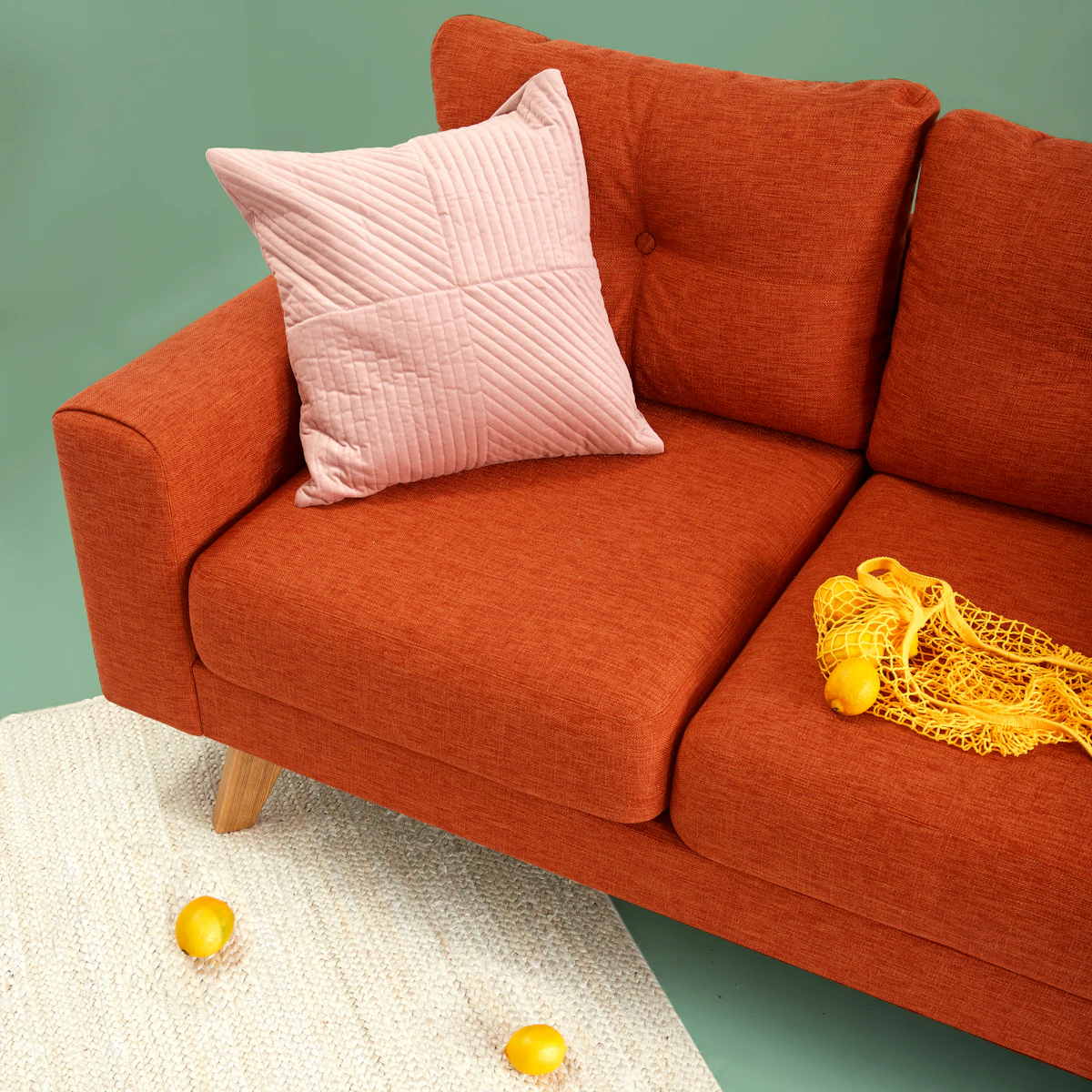
Take a cushion, a curtain or a piece of wood from the room to the paint shop and compare it with the swatch. Wood floors with a warm, honey tone suit warm neutrals and soft greens. Grey floors suit cool neutrals and blues. A red or orange sofa needs a neutral wall, not a coloured one, or the two will compete. If your furniture is dark, a pale wall creates contrast and keeps the room bright. If your furniture is pale, a mid-tone wall adds depth and stops the room looking washed out.
How much paint you will need
Measure the wall area, subtract doors and windows, and divide by the coverage on the tin, usually about 10 square metres per litre (350 square feet per gallon). Most rooms need two coats, so double the result and round up to the next tin size. A typical living room of 4 by 5 metres with 2.4-metre ceilings needs roughly 8 to 10 litres for two coats, depending on doors and windows. Our paint calculator does the sums for your exact room, including coats and coverage.
Try the paint calculator and read how much paint do I need.
Common paint mistakes to avoid
The most common mistakes are choosing from a tiny swatch, painting in the wrong light, using gloss on a bumpy wall, and painting every wall a bold colour. Other mistakes are skipping primer on a dark wall, which wastes paint and leaves patchy colour, and painting over a damp or greasy wall without cleaning it first. Prepare the wall, use a good brush for edges and a roller for large areas, and paint in daylight so you can see missed patches. Two thin coats always look better than one thick coat.
Key measurements at a glance
These are the standard measurements used by designers for a room like this. They are the same figures used throughout this guide, collected here so you can check them at a glance while you plan.
| What | Measurement |
|---|---|
| Sofa to coffee table | 35–45 cm (14–18 in) |
| Main walkways | 75–90 cm (30–36 in) |
| Rug wider than sofa, each side | 20–30 cm (8–12 in) |
| Art centre height | 145 cm (57 in) from the floor |
| TV viewing distance (55 in screen) | 2.1–3.5 m (7–11.5 ft) |
| Colour balance | 60% dominant, 30% secondary, 10% accent |
5 mistakes to avoid
- A rug that is too small — the front legs of the seating should sit on it.
- One ceiling light only — layer light at three levels instead.
- Pushing every piece against the walls, leaving a dead space in the middle.
- Art hung too high — the centre should sit about 145 cm from the floor.
- Buying furniture before measuring the room and the doorways.
Frequently asked questions
What is the best paint color for a living room?
A warm neutral such as greige or warm white suits most living rooms, because it works with most furniture and most light. North-facing rooms suit warmer shades; south-facing rooms suit cooler ones. Always test a large sample first.
Should I paint my living room light or dark?
Light colours make a room feel larger and brighter and suit small or dark rooms. Dark colours create intimacy and suit large rooms with good light. A single dark accent wall is a safe way to try a bold colour.
What paint finish is best for living room walls?
Eggshell is the best all-round choice: it has a soft sheen, hides small imperfections, and wipes clean. Use matt on ceilings and satin on woodwork.
How much paint do I need for a living room?
Measure the walls, subtract doors and windows, and divide by the tin coverage, usually about 10 square metres per litre. Most rooms need two coats. A typical 4 by 5 metre room needs about 8 to 10 litres for two coats.
Can I paint just one wall a different color?
Yes. An accent wall behind the sofa or fireplace adds depth without darkening the room. Choose a colour already present in the room, such as a cushion or rug colour, so it looks connected.
Note: measurements and spacing guidance in this article are general design guidance for typical homes, in imperial and metric. Check manufacturer instructions and local building regulations for your specific project, especially for electrical, plumbing and structural work.